Behind the Design of a Playful Hamptons Home Inspired by Strawberry Fabric
ByVaishnavi Nayel Talawadekar,Photography byBrett Wood,Styling byTim Brown
PublishedMar 7, 2026 2:43 AM EST
We may earn revenue from the products available on this page and participate in affiliate programs.
Sign Up for Domino's Newsletter
By signing up, you confirm you are 16+, will receive newsletters and promotional content and agree to ourTerms of Useand acknowledge the data practices in ourPrivacy Policy. You may unsubscribe at any time.
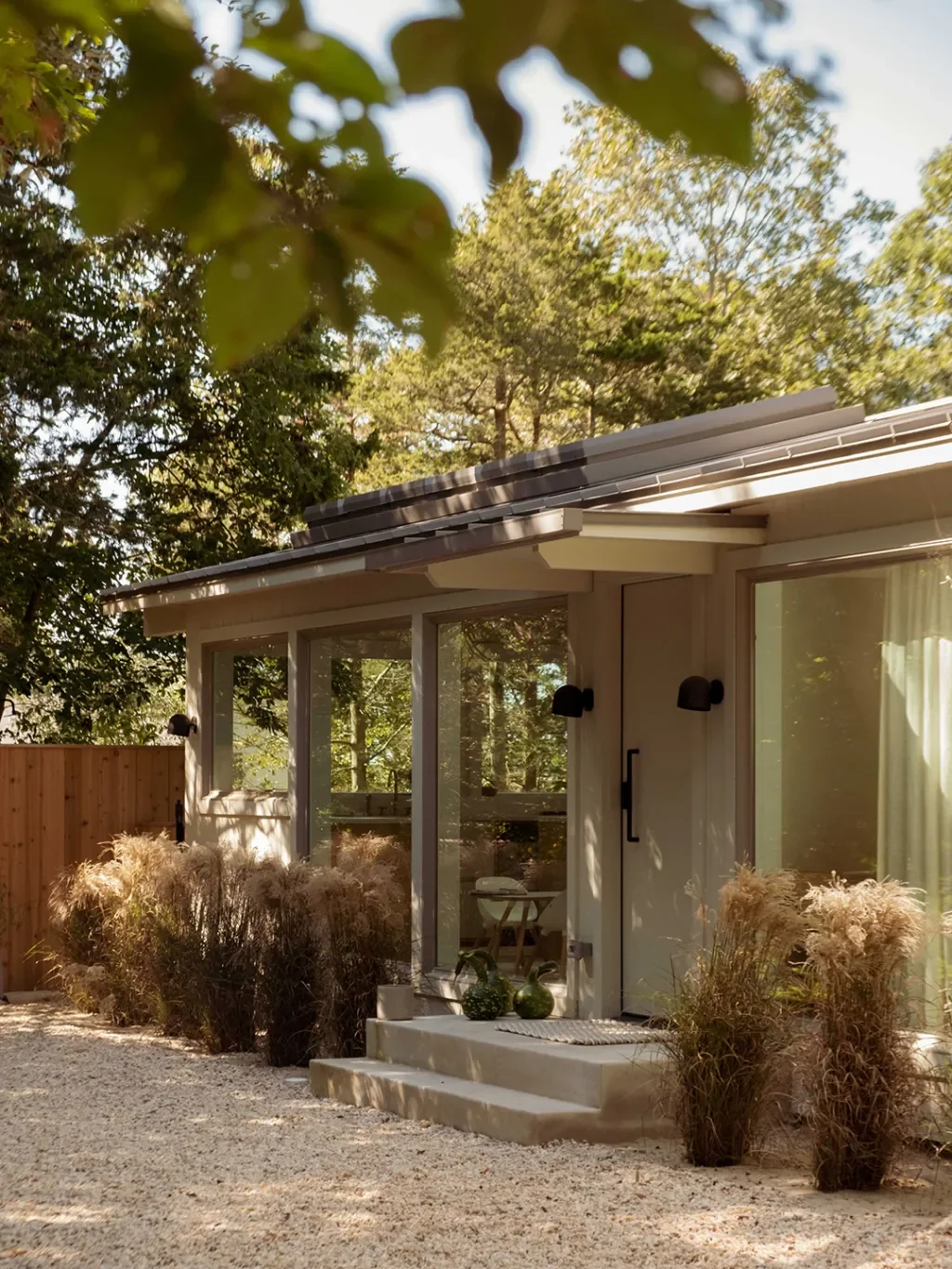
Interior designerLauren Carluccicould totally see why her clients thought they were in for more of a tune-up than a takeover for their East Hampton house. The family, a New York City couple with three young daughters, had spent many long summers and festive holidays at the cedar shake-sided respite, which is perched on a leafy lot just minutes from the beach.
But, after a decade, the getaway was starting to show its age, and the interiors needed a refresh to keep up with the pace of real life. (Think: sandy toes padding in from the shore, dinners that turn into dance parties, and kids ricocheting from one room to the next.) Relatable much?
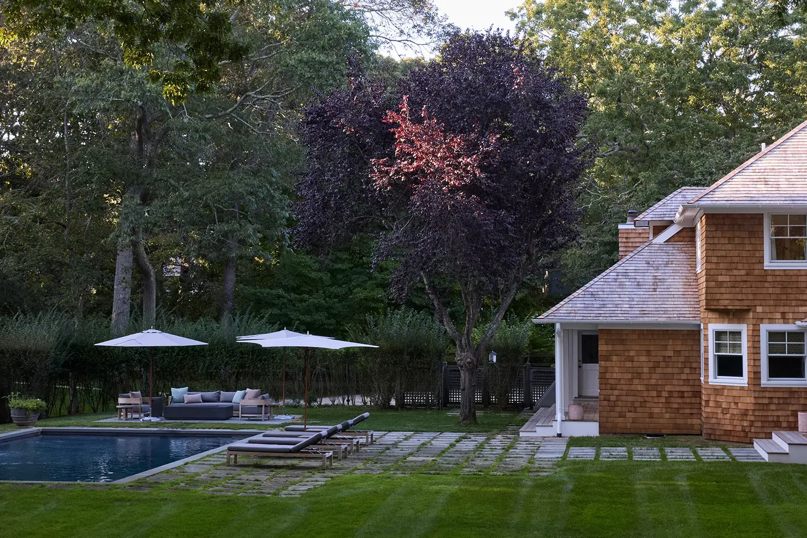
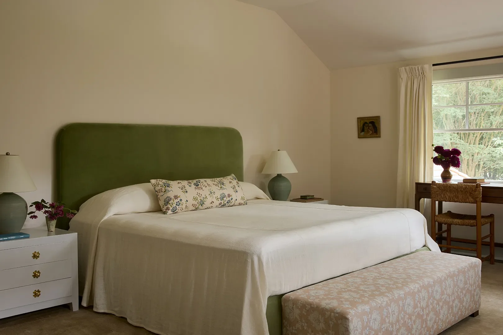
The brief started out politely: muted tones, traditional lines, nothing too loud. To Carlucci, the project had straightforward written all over it. Then came the fabric meeting—and the mood shifted entirely. Swatches hit the table and suddenly the clients were reaching for the bold stuff. Punchy florals. Happy stripes. Colors with a pulse. Seeing textiles in person changed everything for the homeowners, and the result? A pattern-happy palette that wasn't too precious and felt immediately lived-in. Honestly, this is the kind of plot twist we live for.
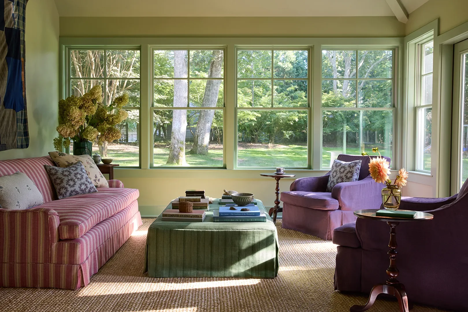
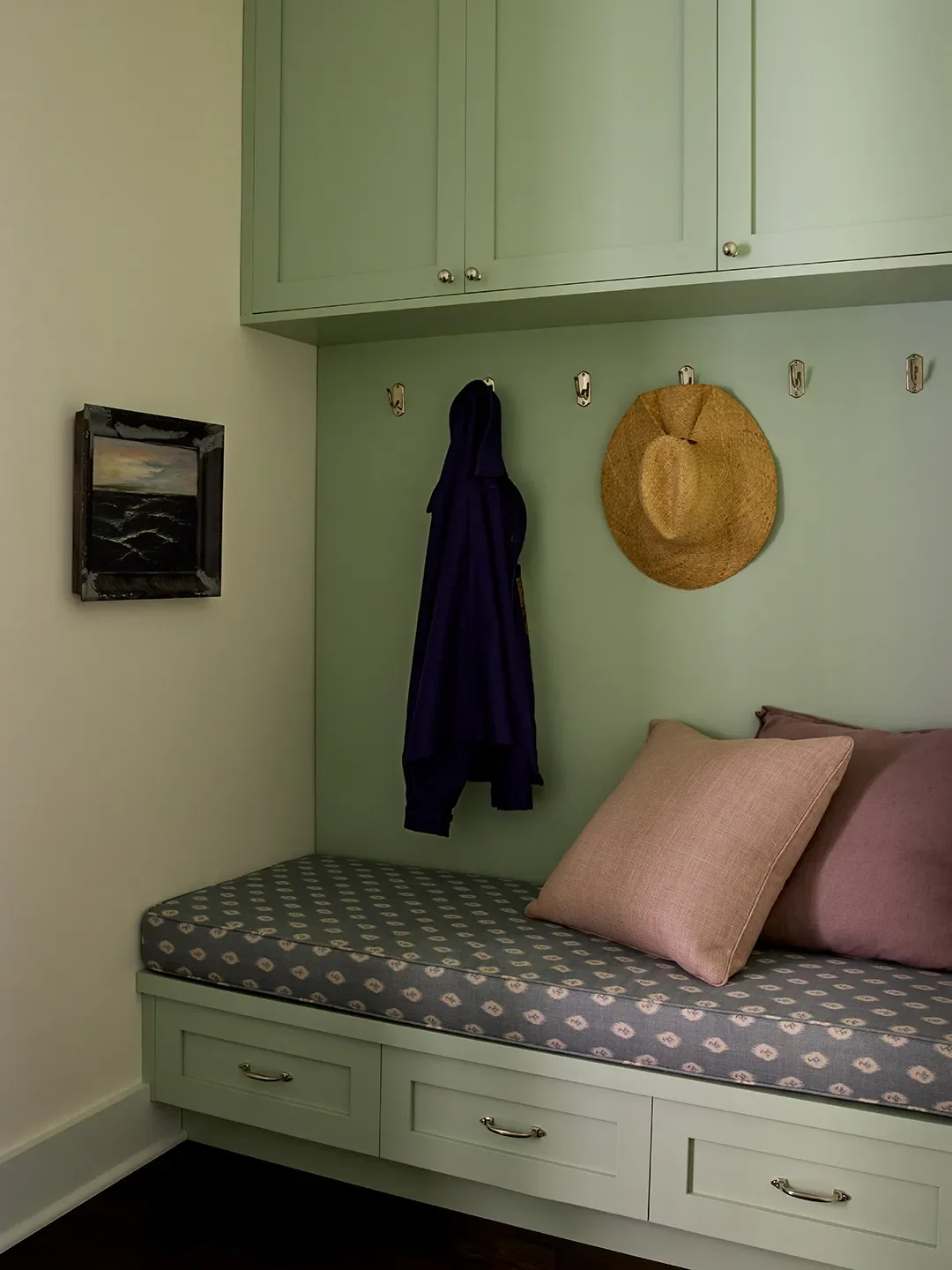
Carlucci gave the floorplan a rethink, too. The kitchen expanded into a true heart-of-the-home hub; an enclosed porch became a sun-soaked all-season room; and a warren of small, choppy spaces was refashioned into a back entry consisting of guest quarters, baths, laundry, and a petite mudroom. Ahead, the designer walks us through the finished layout, pointing to how the punched-up color and decor pulls it all together.
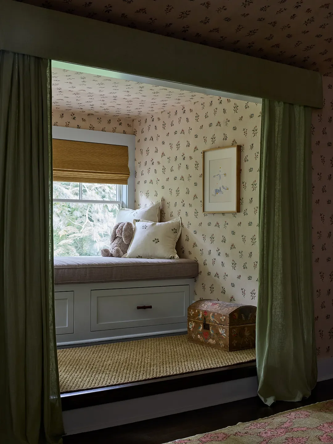
One of the very first purchases was a small-scaleembroidered strawberry fabric by Chelsea Textiles, used in the twins' bedroom (see it on the pillows in their window seat). The client fell in love immediately, because she calls the girls her "little strawberries." That fabric set the tone for the entire project: sweet, personal, and layered with meaning. I mean, could that be any cuter?
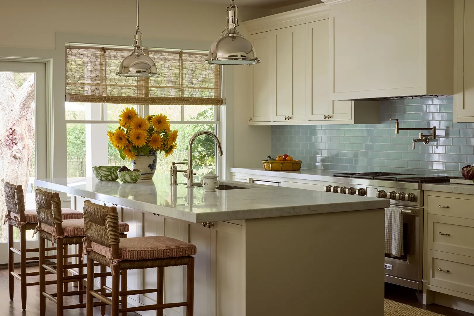
The blue tile backsplash in the kitchen felt like the biggest risk. A late pivot, it initially seemed like a leap—but without it, the kitchen might have felt too restrained compared to the rest of the home. Choosing color instead of another neutral added the right softness and tied the spaces together. Trust me on this—sometimes that little leap of faith pays off big time.
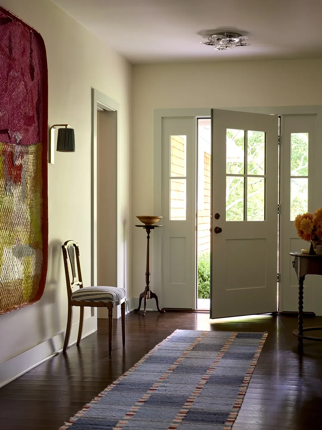
Definitely theElizabeth Eakinsstair runner. The staircase is a major visual and circulation element, and the pattern adds texture while feeling incredibly comfortable underfoot—a true functional luxury. Sometimes you just have to go for the good stuff.
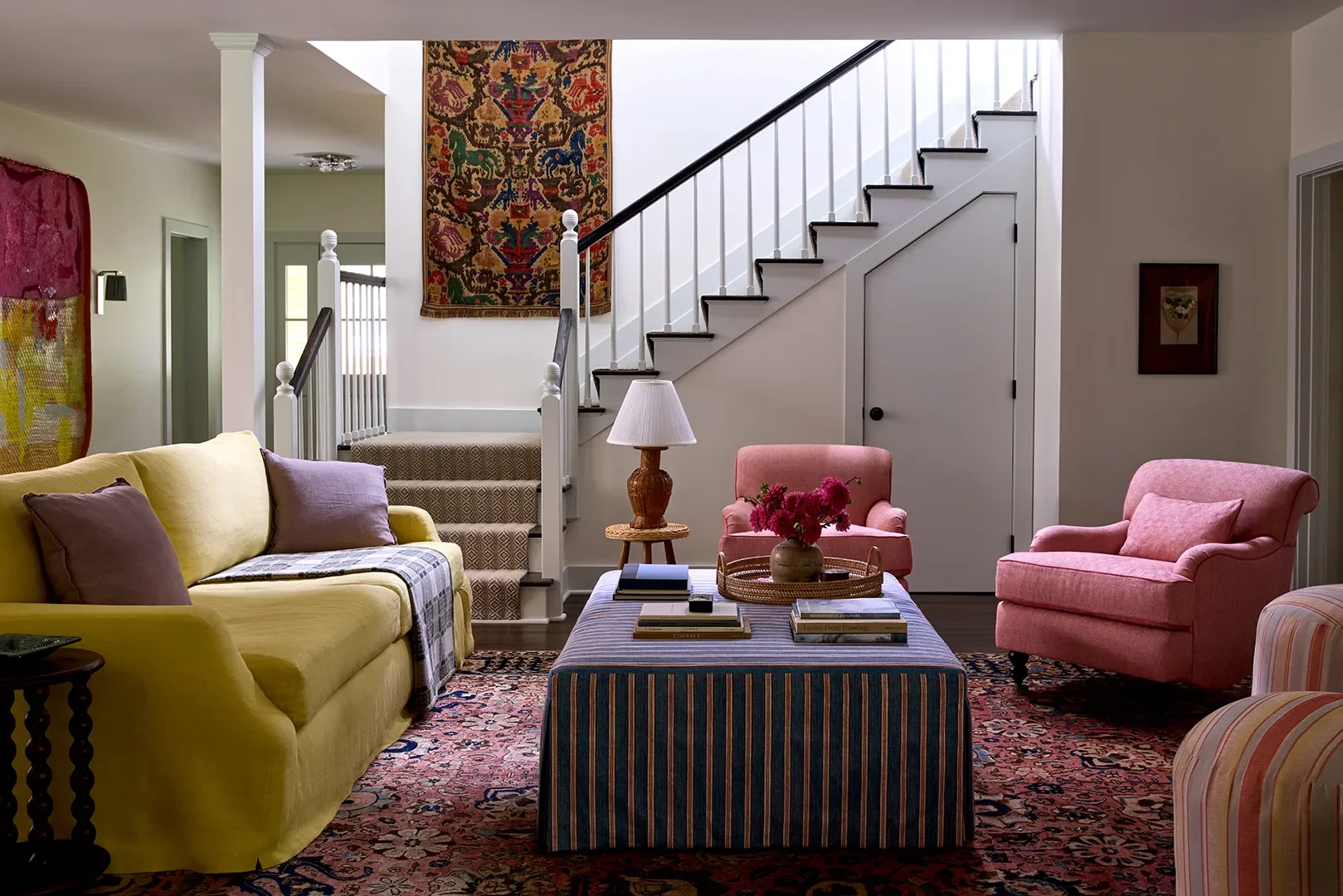
Thoughtfully reusing and reupholstering existing furniture instead of replacing everything. This allowed the budget to go towards customized elements while keeping the home personal, with many rugs already a part of the client's collection. Smart and sentimental—love that combo.
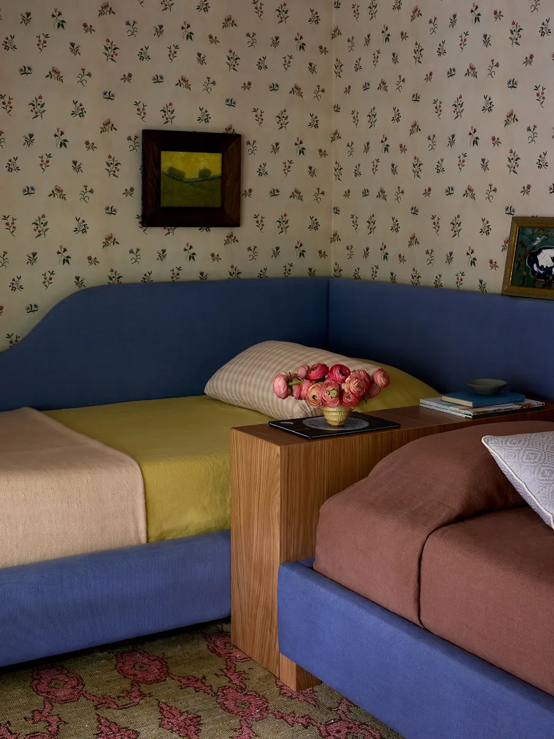
The custom daybed bench in the twins' room. It transformed a small alcove into a cozy reading and play spot with integrated drawers for toys and books. Draped with alightweight weave by Volga Linen, it now moonlights as a makeshift stage, where the girls host impromptu performances—costumes optional, applause mandatory. How adorable is that?
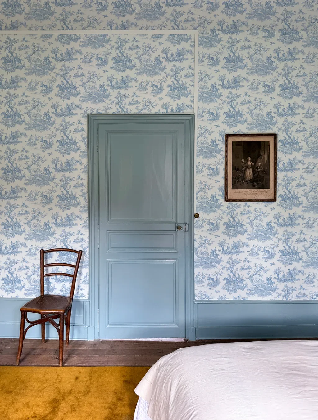
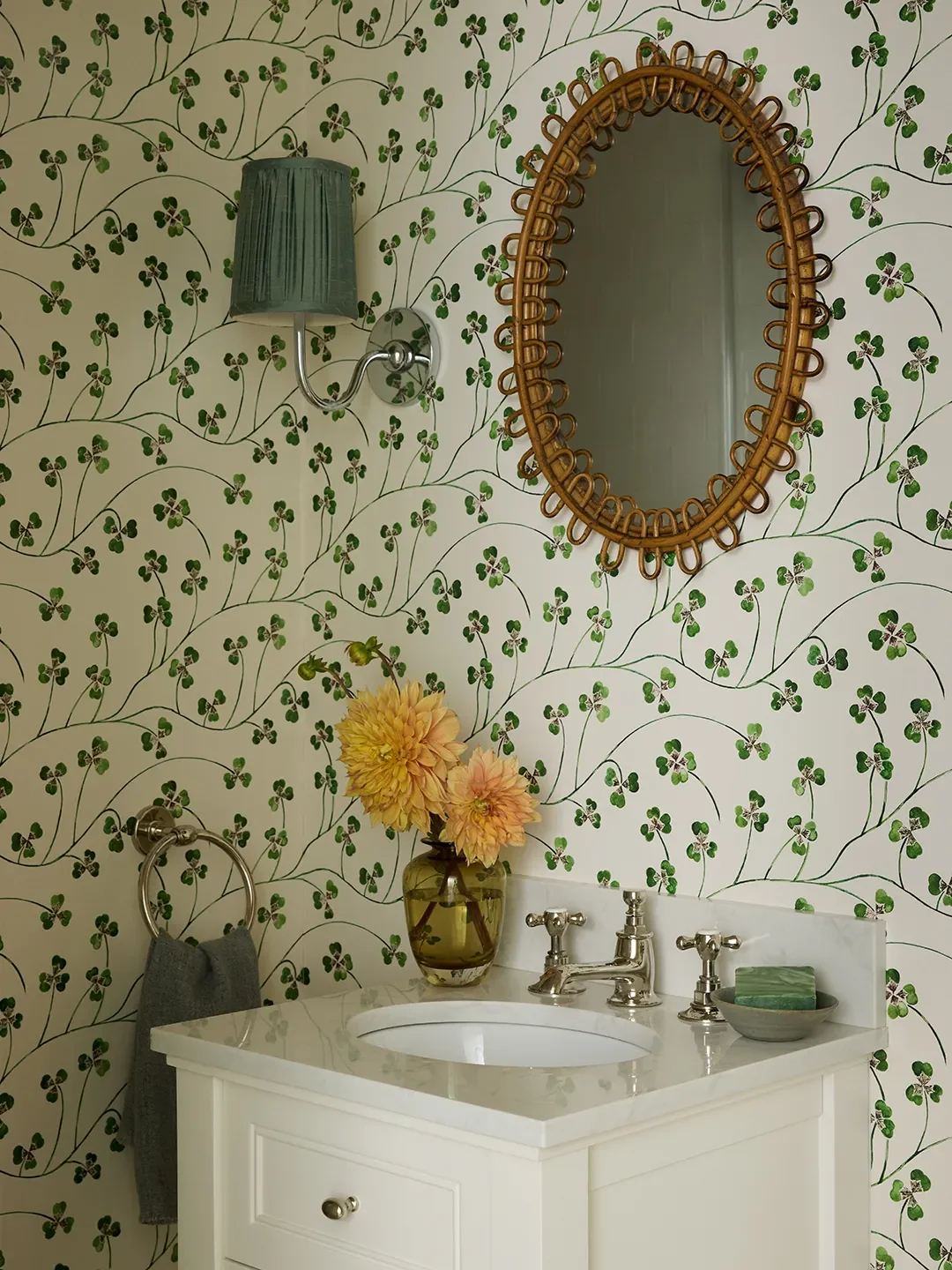
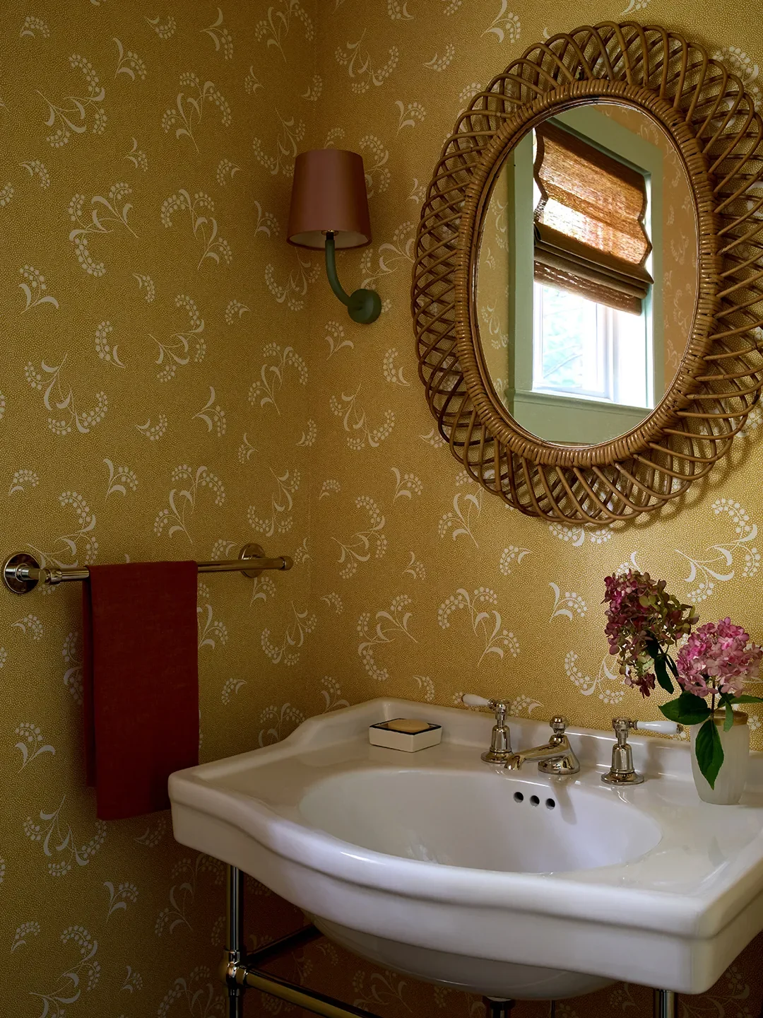
The clover wallpaper and matching hardware backplates are a cheeky nod to luck. They're dreamy and whimsical. Then there's the yellow mimosa wallpaper. It reminded me of the bright yellow fields that blanket the Cotswolds near my mom's house each spring. The mimosa motif has also long been associated with femininity, which felt especially fitting in a home centered around a mother and her daughters. Such a thoughtful touch.
One of my favorite upholstery moments is the pink stripe fabric bySusan Delisson the sofa. It pops against greens and blues and brings energy year-round. I'm here for that kind of joyful color.
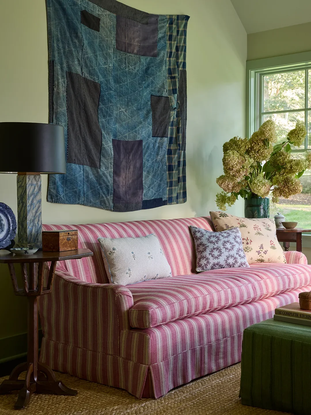
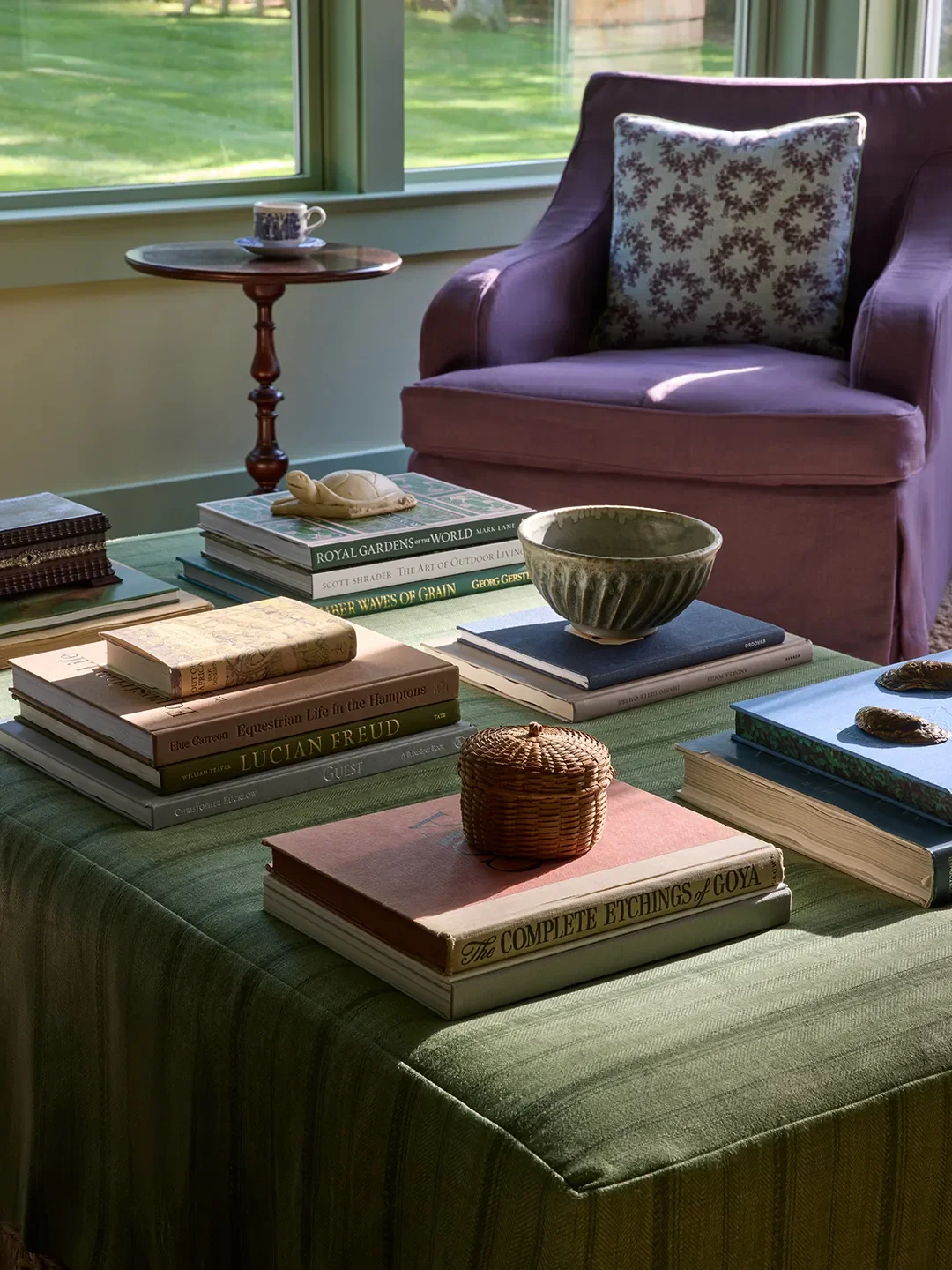
During installation, a nearly 100-pound, heavily-textured artwork slipped off the wall seconds after it went up. Thankfully, no one was hurt, but with move-in quickly approaching, it became a problem-solving sprint. My art-world experience helped, and with FaceTime guidance from the artist, a few supply runs, and careful teamwork, the piece was repaired and rehung just in time. It was a stressful moment that perfectly captured how collaborative and supportive the industry can be. Honestly, the best design stories always have a little drama, right?

Vaishnavi Nayel Talawadekar is an architecture, design and art journalist who serendipitouslysegued into journalism in 2016, after realizing spreadsheets weren't her thing. She lives in New Delhi with her husband and their two gremlins, ages 3 and 1.
Learn more about Domino.comEditorial Standards