The Number-One Rule of Decorating a Space With Exposed Brick
ByLydia Geisel,Photography byTim Lenz
PublishedJan 6, 2023 1:15 AM EST
We may earn revenue from the products available on this page and participate in affiliate programs.
Sign Up for Domino's Newsletter
By signing up, you confirm you are 16+, will receive newsletters and promotional content and agree to ourTerms of Useand acknowledge the data practices in ourPrivacy Policy. You may unsubscribe at any time.
OK, so exposed brick and natural light are basically the two things every city dweller dreams of having. But what if you've got way too much of the first and barely any of the second? For one family of five in Manhattan's West Village neighborhood, that was exactly the case. Their kitchen, dining nook, and living room are located below street level, meaning sunshine is a rare commodity. And to make matters even dimmer? The whole area is covered in exposed brick.
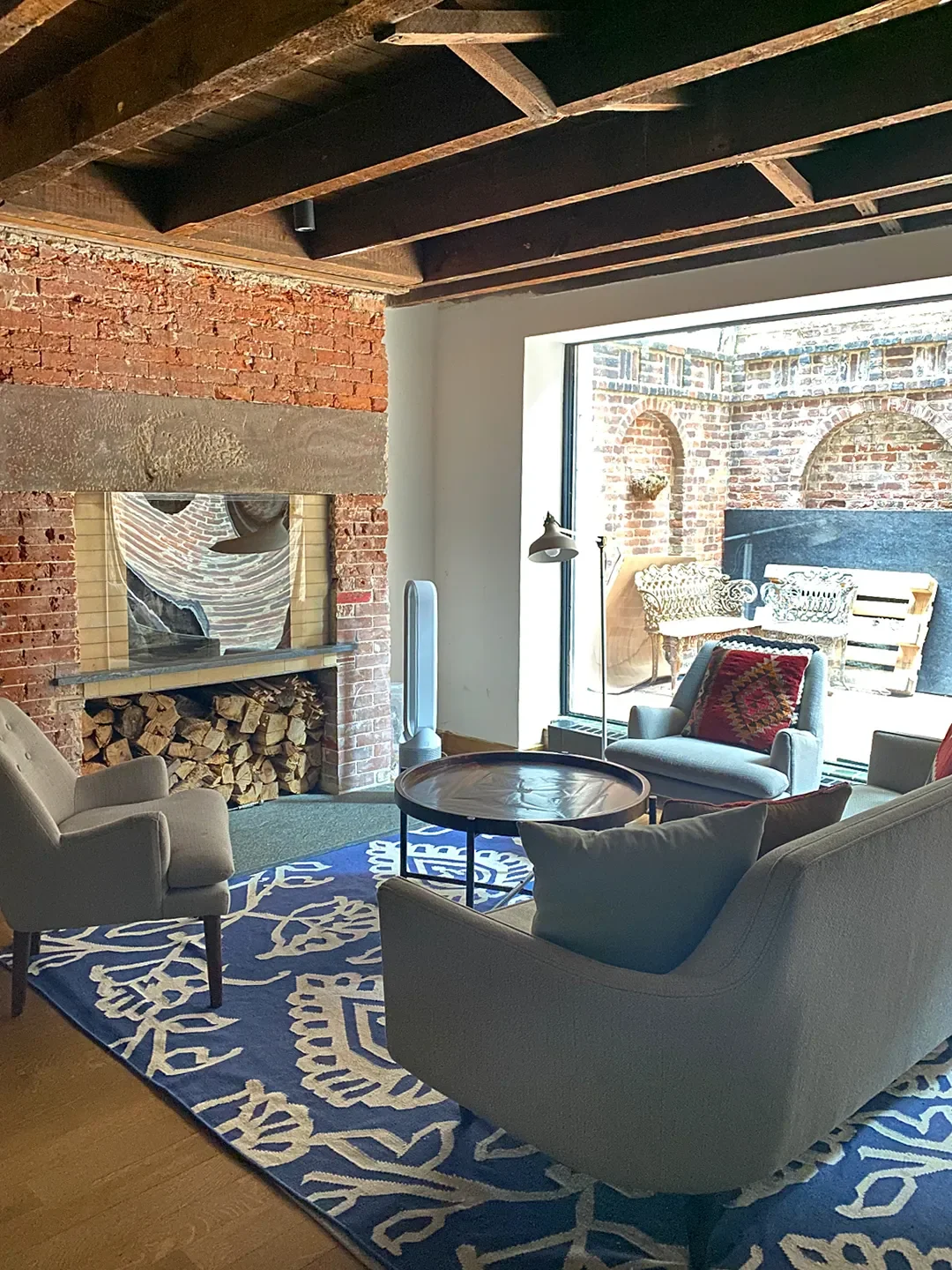

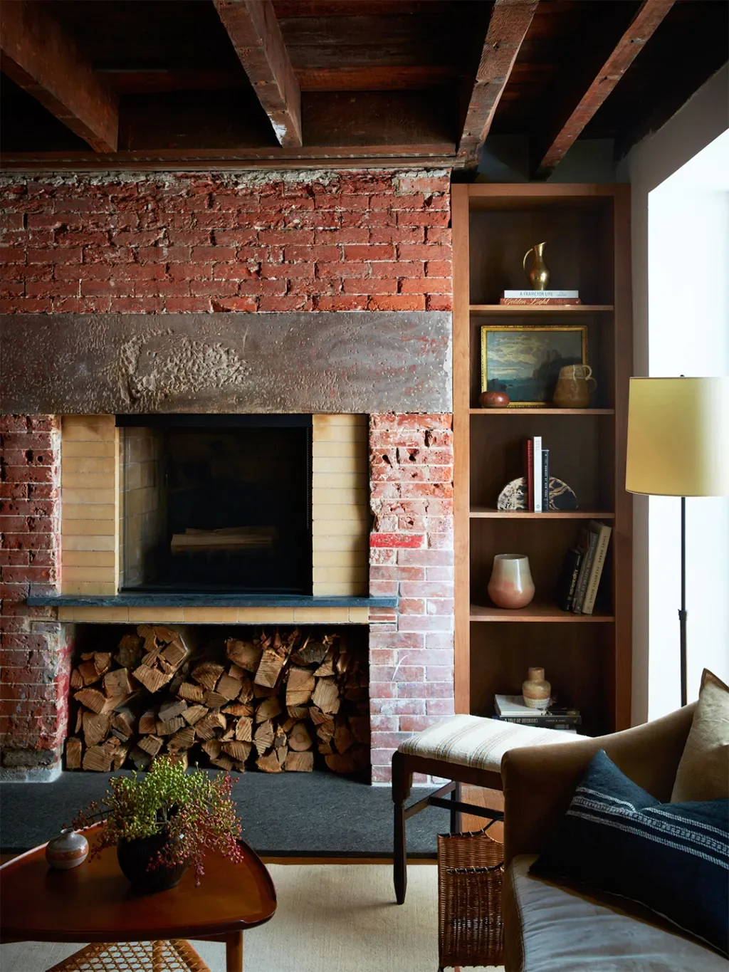
"It's a lot of brown," admits designer Maureen Ursino, noting that even up above, the wood ceiling beams and planks from the turn of the century are still going strong. Ursino was tasked with turning the 200-square-foot space into a cozy-but-not-cabin-y hangout—without touching the historical features the clients were adamant about keeping. "So we leaned into pulling colors found in the bricks to further accentuate it," explains Ursino. Ahead, she shares her dos and don'ts of decorating around a LOT of red. Trust me, you'll want to bookmark this.
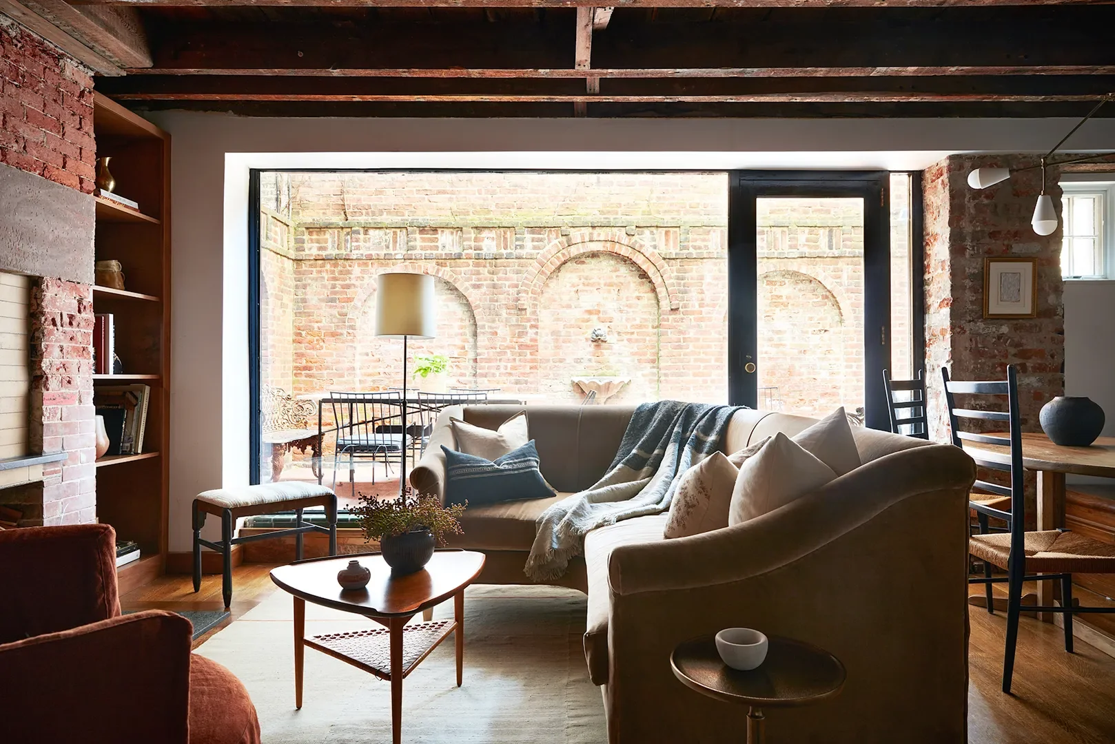
I know, investing in a cream-colored sofa might seem like an easy way to brighten things up, but it's honestly a lot for the eye to handle. "We purposefully didn't want anything that felt too contrasting," shares Ursino. Colors like butter yellow (peep the sectional!), beige, apricot, and burgundy are cheery without being jarring. The only doses of white against the brick walls are the sliver of kitchen cabinets in the adjacent space and the bulbs on the Apparatus pendant lamp hanging over the dining table. "If you're going to use brighter colors in a space like this, it just has to be done in small, thoughtful amounts," she adds. Good advice, honestly.
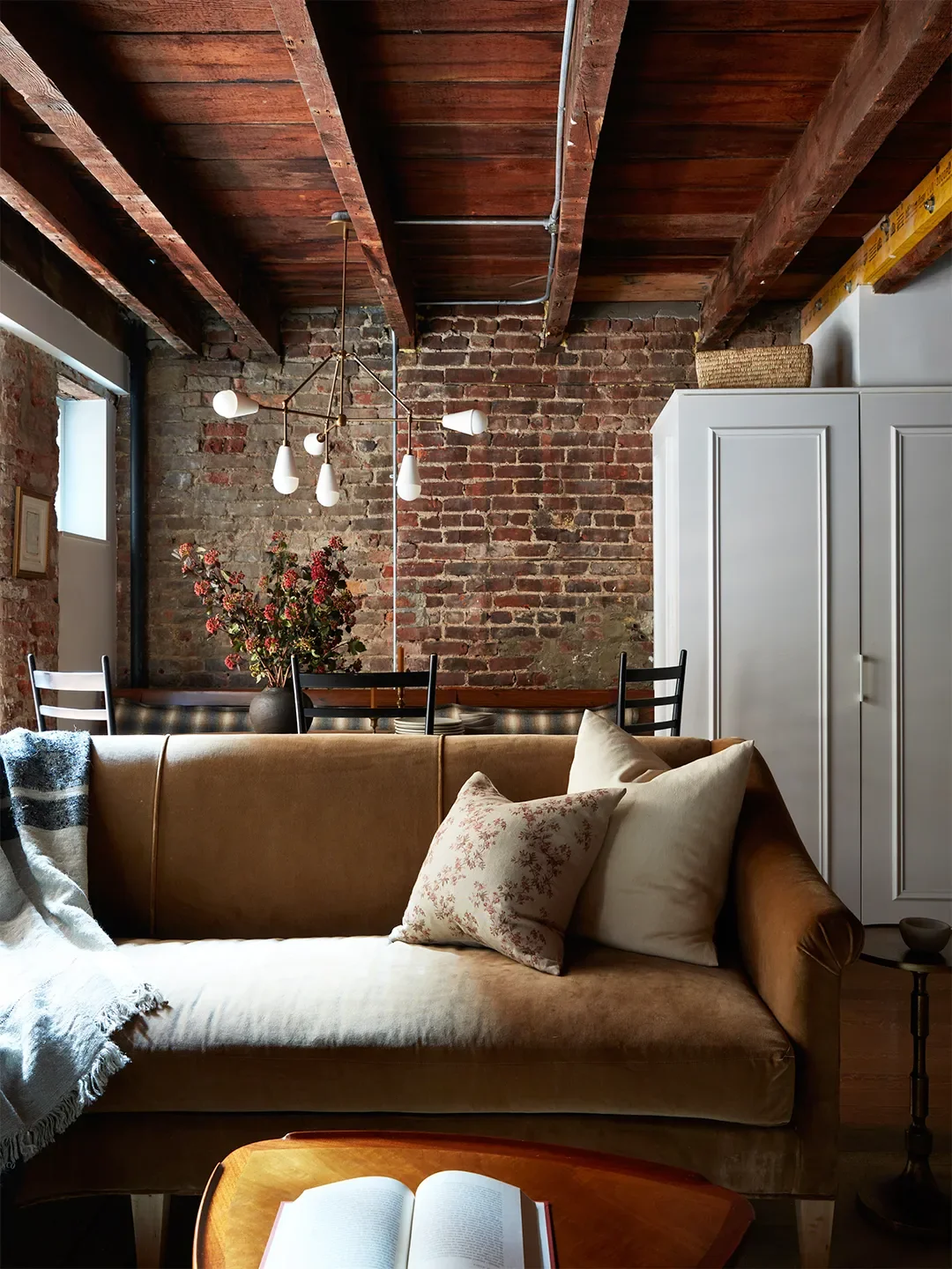
The place to spice things up? Textures, friends. The rich gold-yellow hue of the Zak & Fox fabric on the sectional might play nice with the red brick, but it's the smooth velvet that provides a completely opposite finish. The same goes for the linen armchair in the corner—unlike rough clay, you actually want to cuddle up to these materials. And honestly, same.
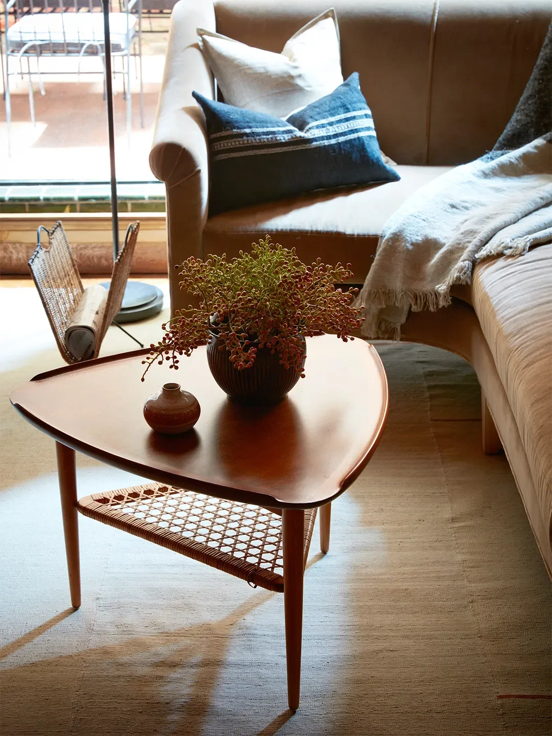
I know it might seem counterintuitive to bring in even more shades from the brown-red family, but Ursino notes that introducing white oak furniture will only pull away from the character of the brick. The wood in her arsenal? Teak (the coffee table), stained oak (the dining table), and walnut (the bookshelves). Trust me, it works.
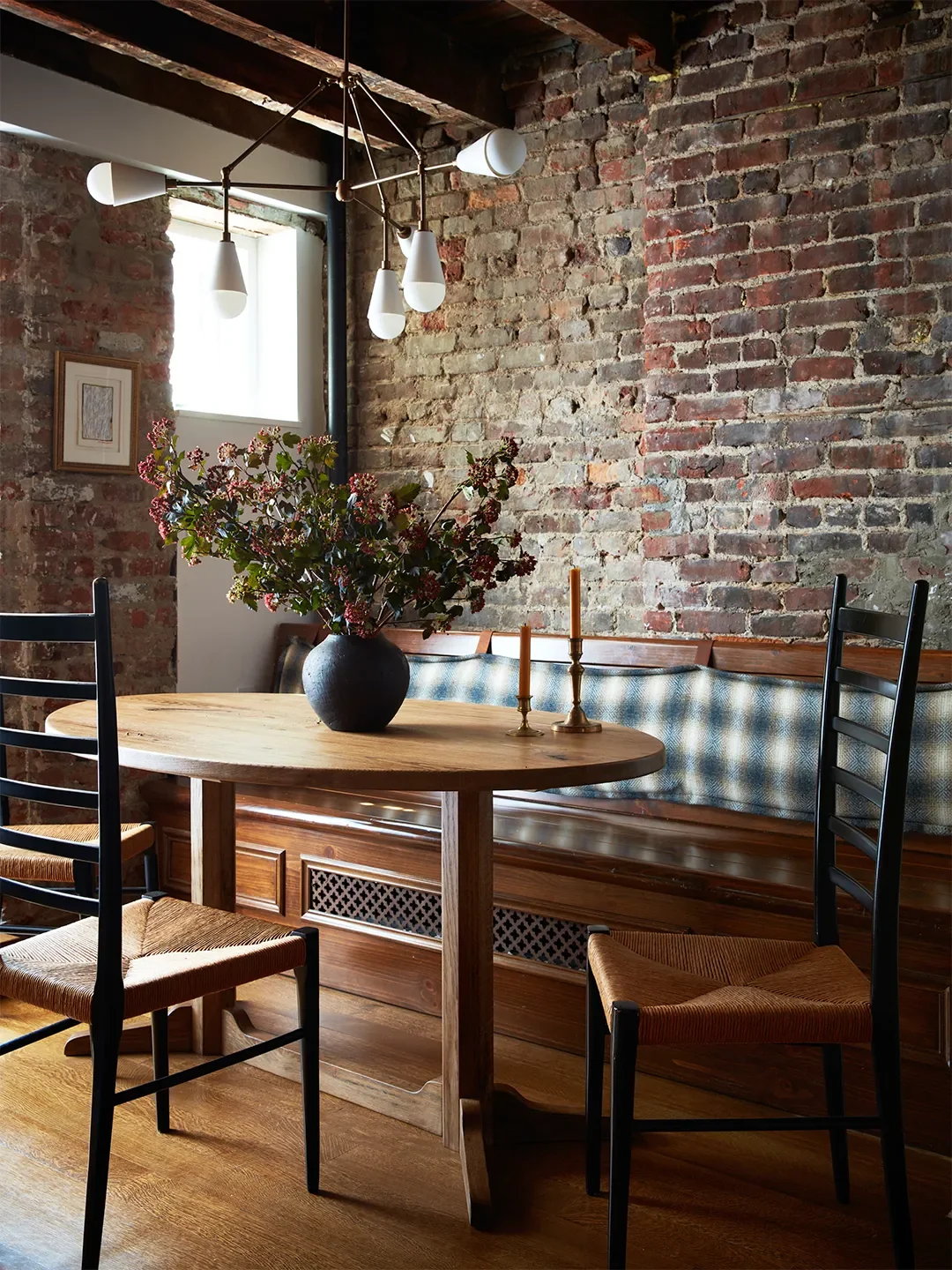
A few blue and green touches—the Libeco throw blanket, the Zara Home pillows, and the dining bench cushion in Abraham Moon fabric—are the sole exceptions to all those warm hues. For the latter, Ursino wanted something that would fit the overall modern-rustic vibe and pair nicely with the charcoal-painted ladder-back chairs. A blurred-out navy plaid was a no-brainer. "I was continually leaning into the cozy nest, and that's something this pattern does very quickly," she says. Things might be darker down here, but they're definitely not dull. I'm honestly all about this vibe.

Lydia Geisel has been on the editorial team at Domino since 2017. Today, she writes and edits home and renovation stories, including house tours, before and afters, and DIYs, and leads our design news coverage. She lives in New York City.
Learn more about Domino.comEditorial Standards